Aire
Client: Aire
Project: Brand Identity
Year: 2020
Spotting a gap in the market of the CBD industry, we worked with Aire to develop an identity that positions itself firmly as a premium lifestyle brand.
The name Aire was inspired by the companies conception in Aire Street Workshops and also subtly aligns with how the product taste and make you feel. The spacious sans serif wordmark and typographic treatments convey a feeling of ease and simplicity whilst retaining a premium aesthetic.
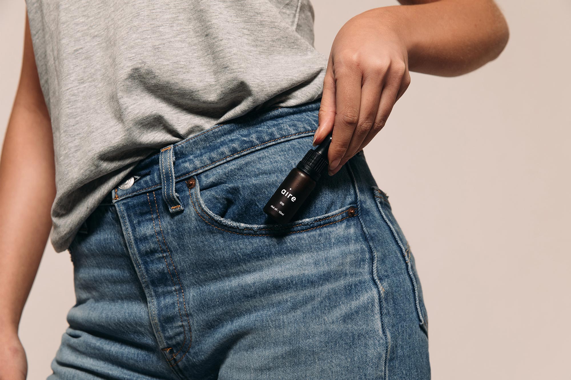
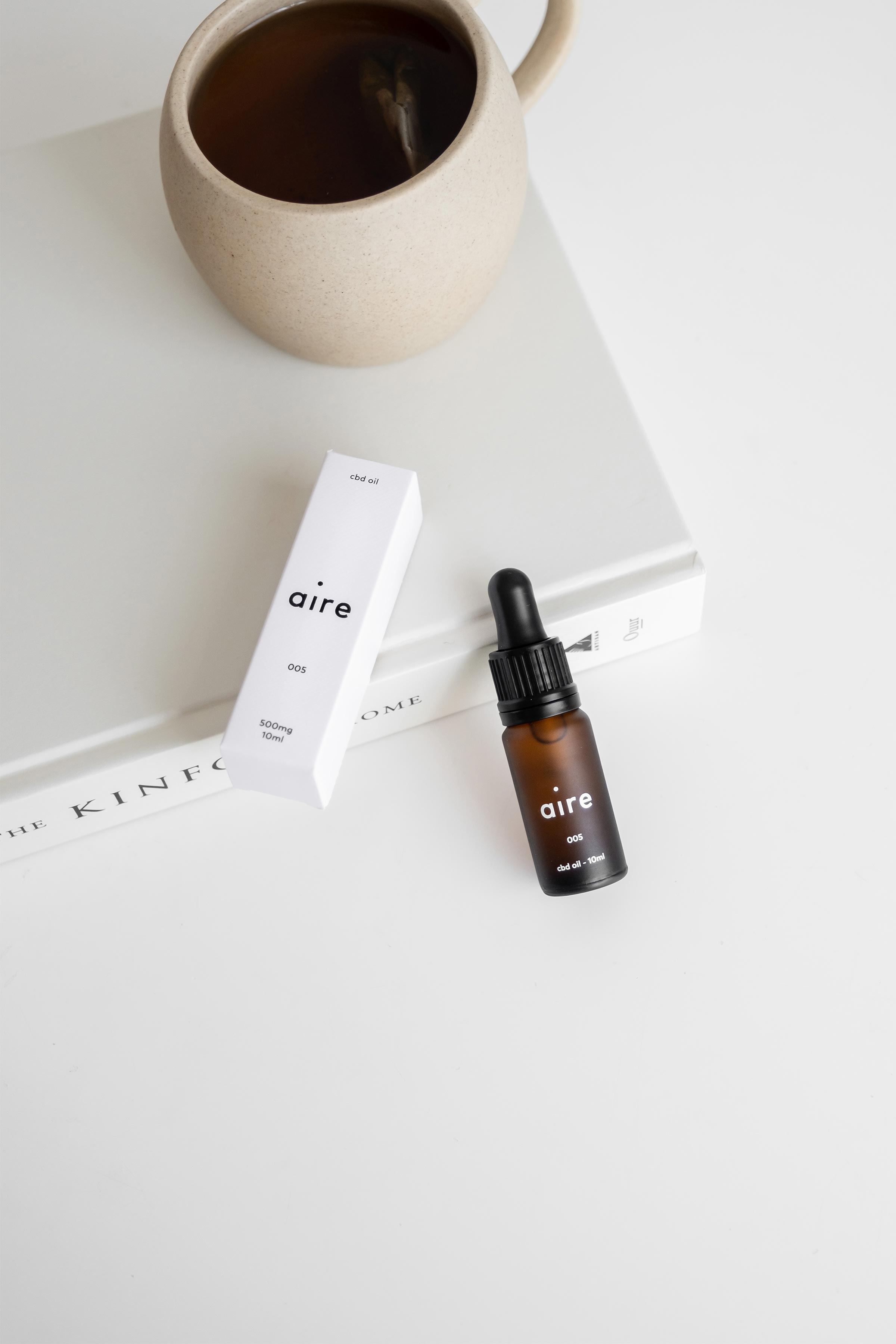
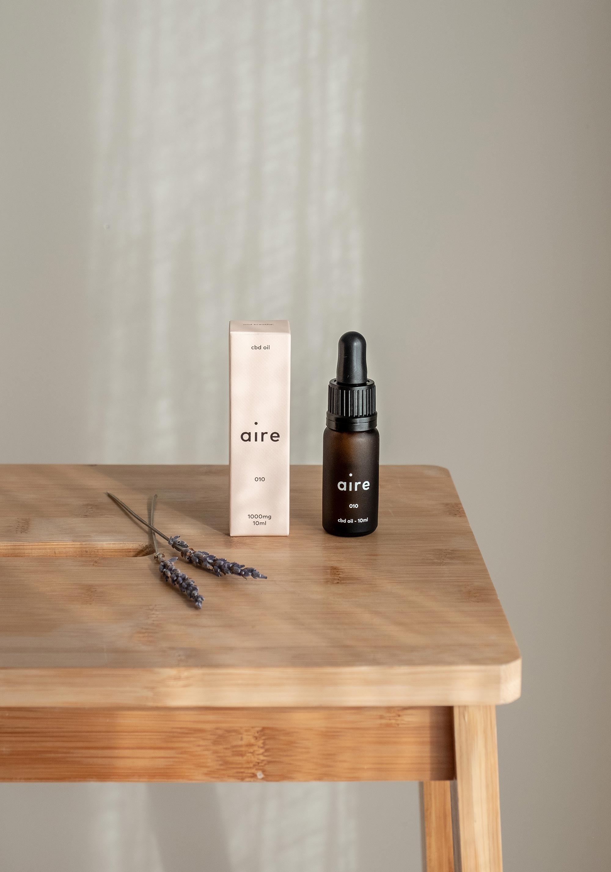
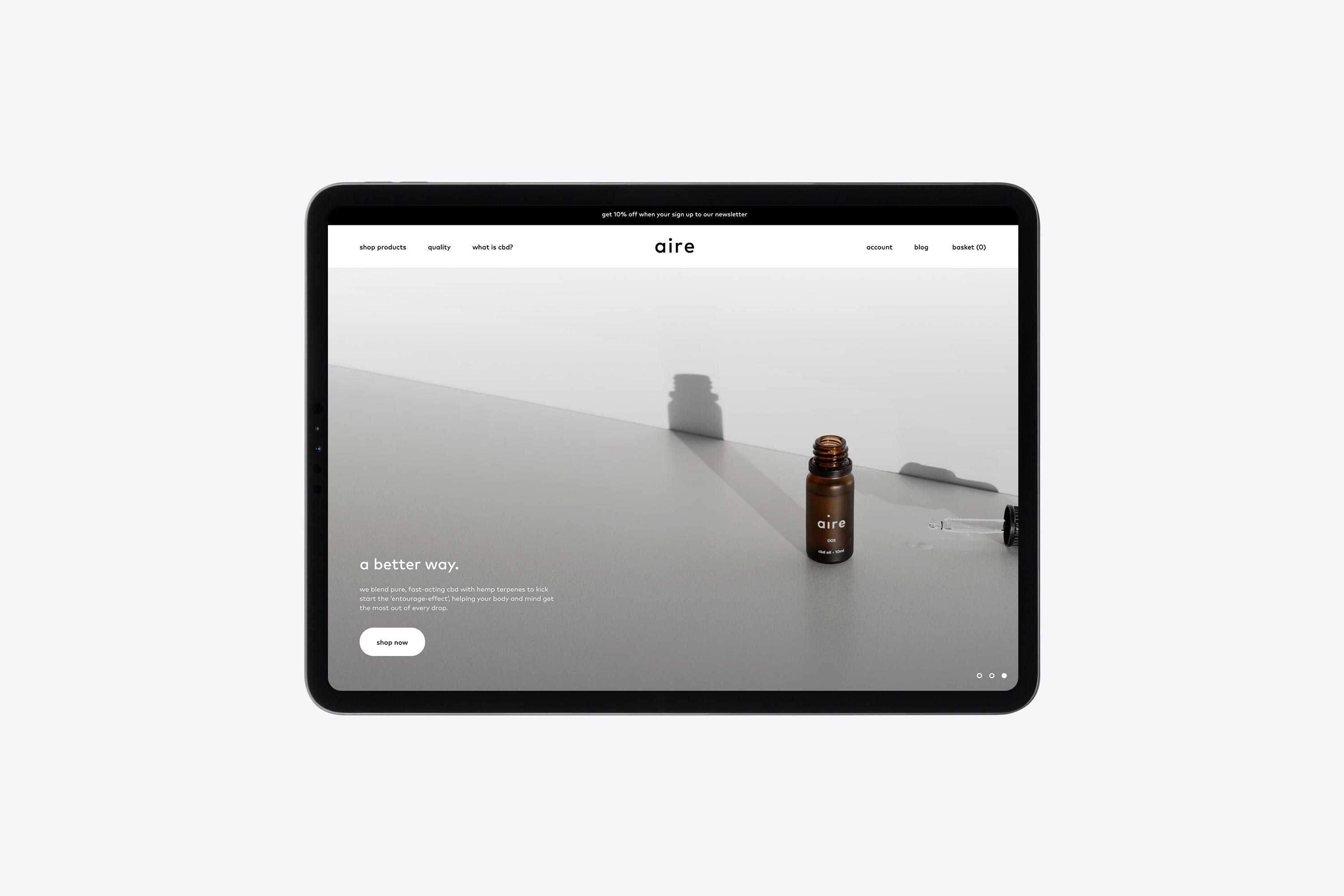
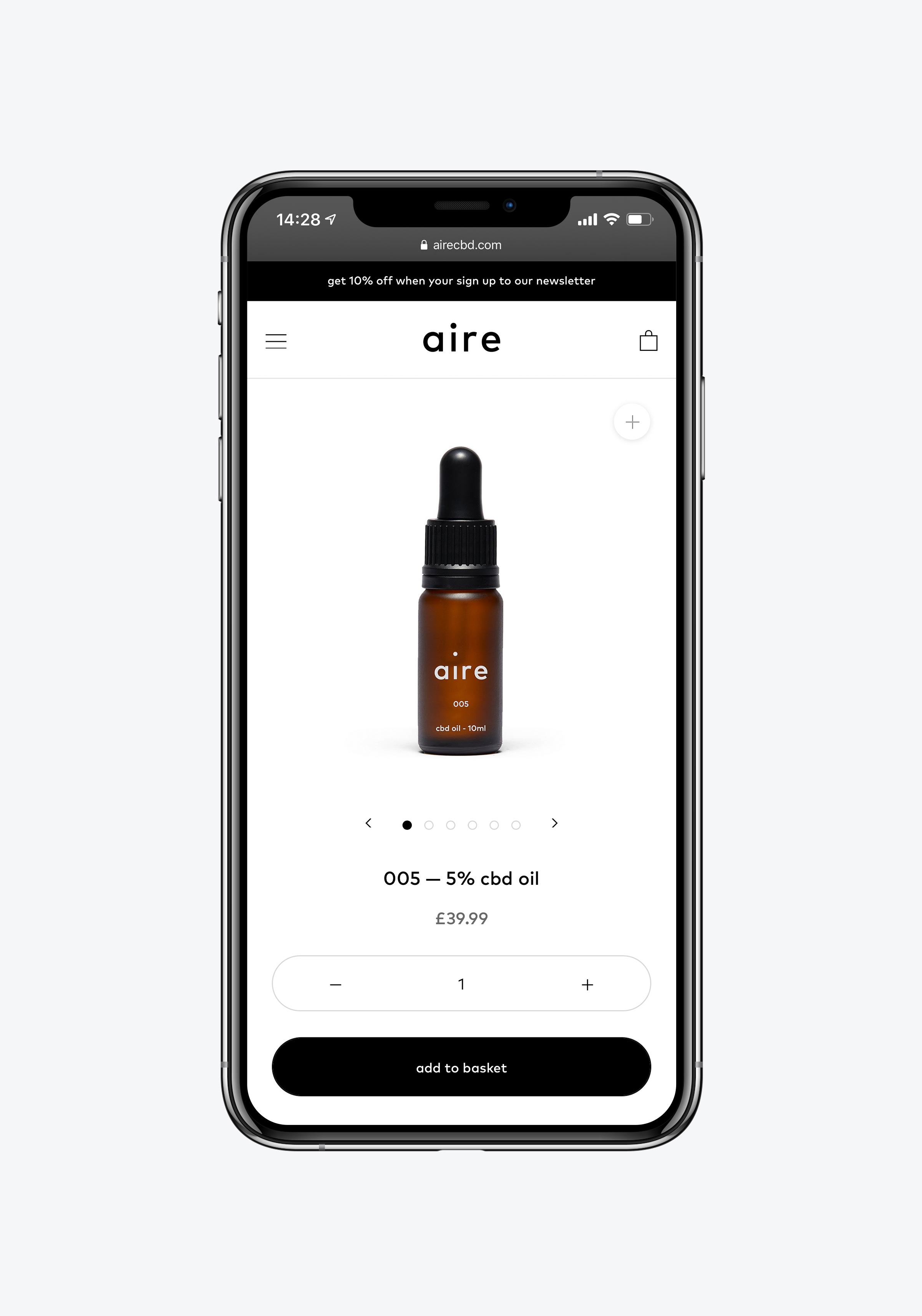
The Aire bottles are constructed from frosted amber glass and finished with a white screen print, doing away with the cliché label wrapped bottles that exist in the CBD industry. To house the bottles, we designed a series of pastel boxes, using a 100% recyclable stock and custom embossing pattern.
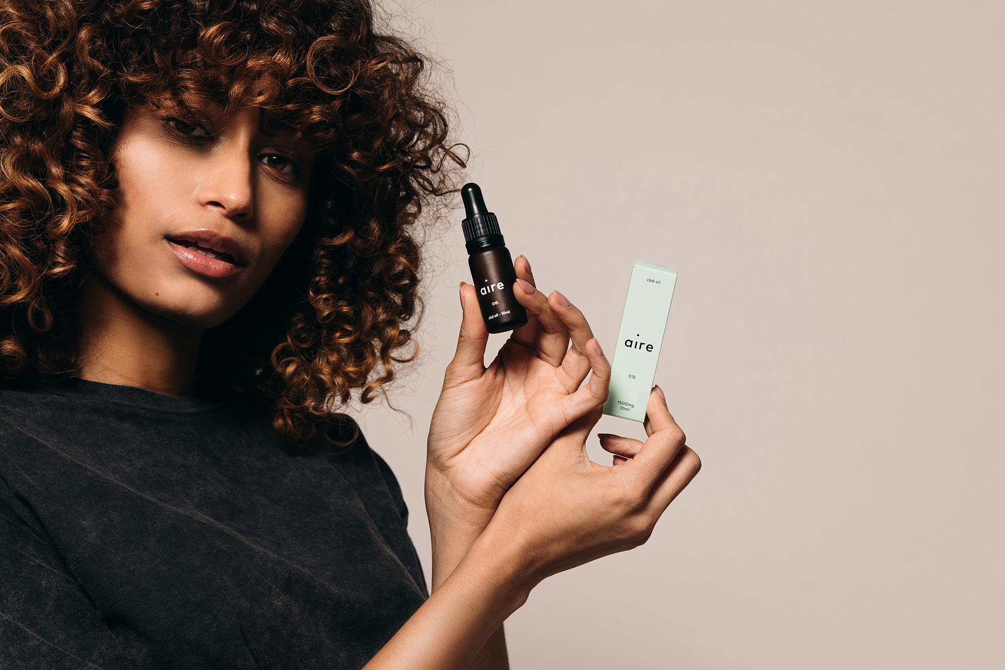
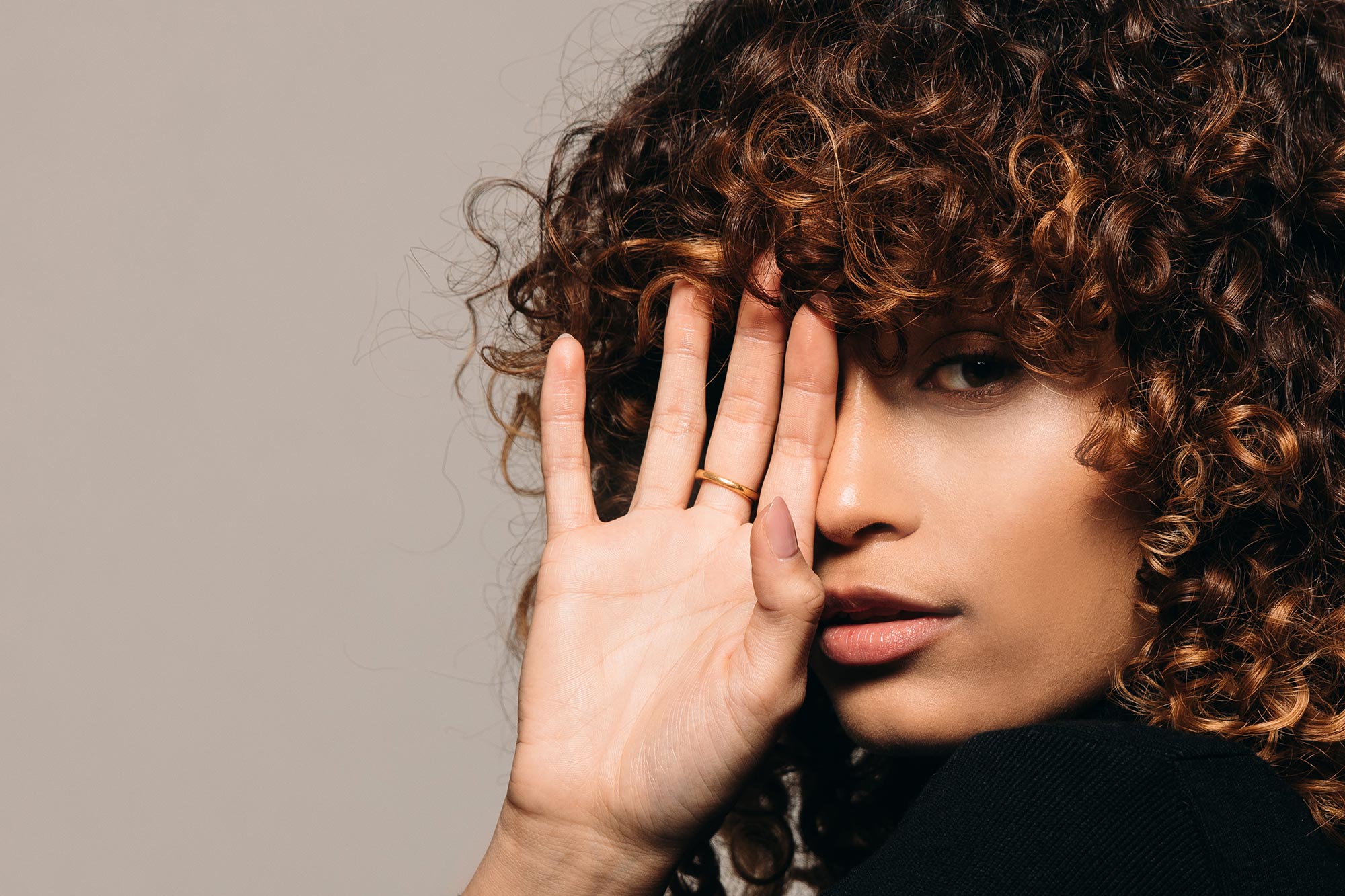
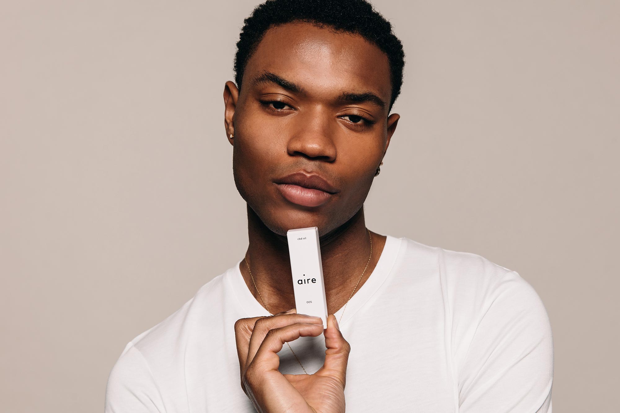
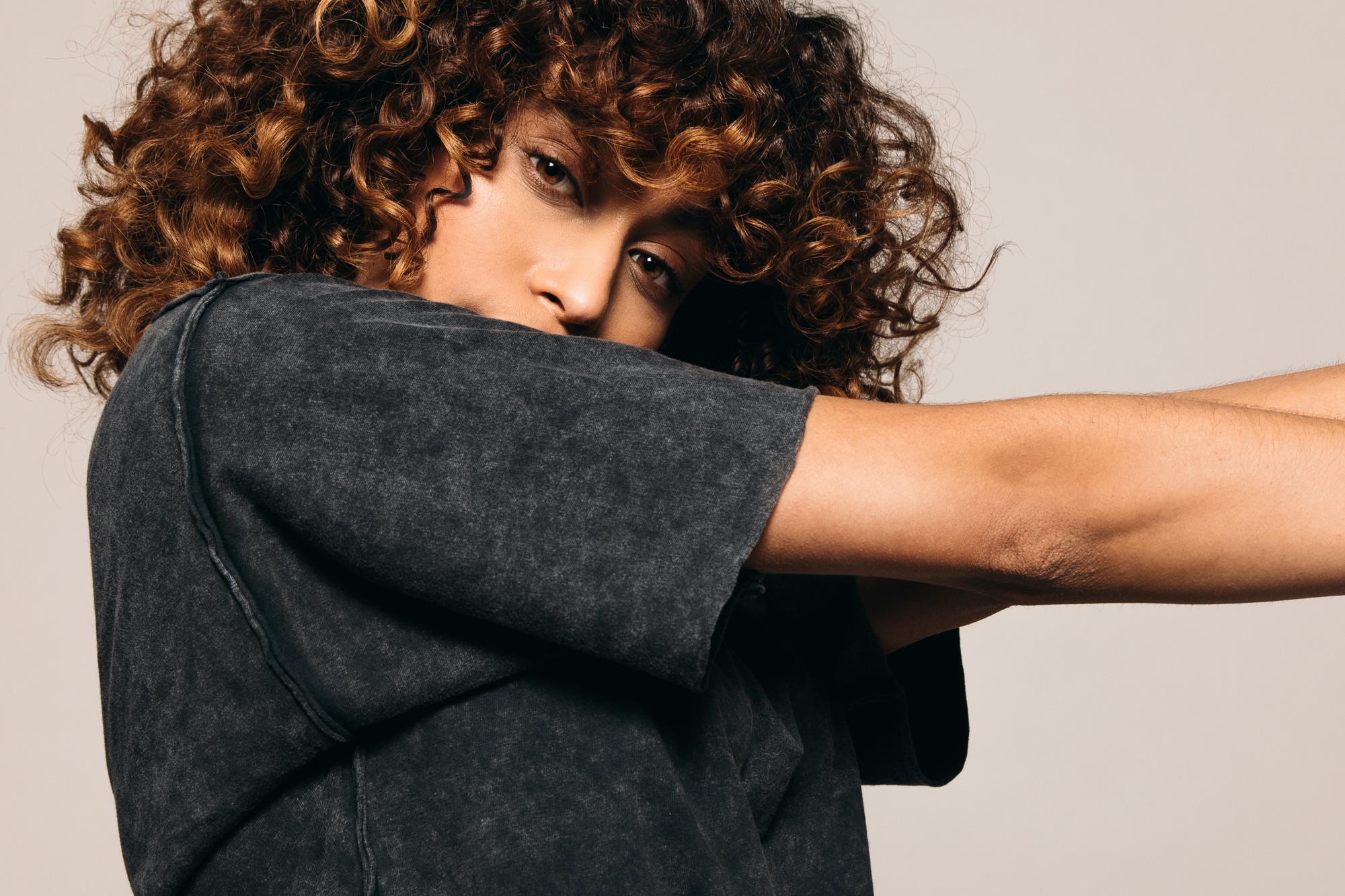
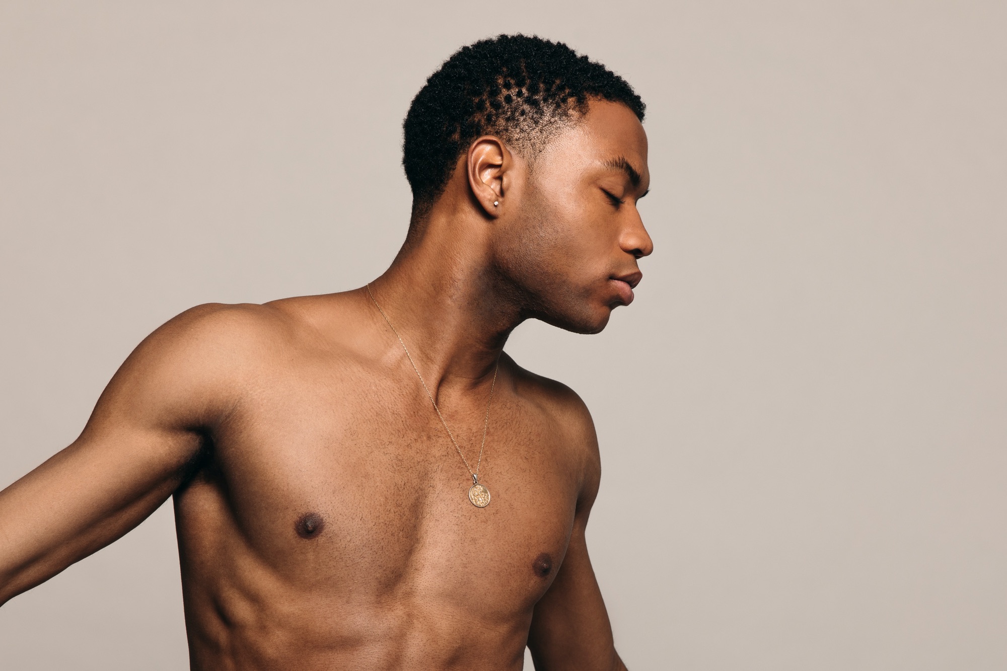
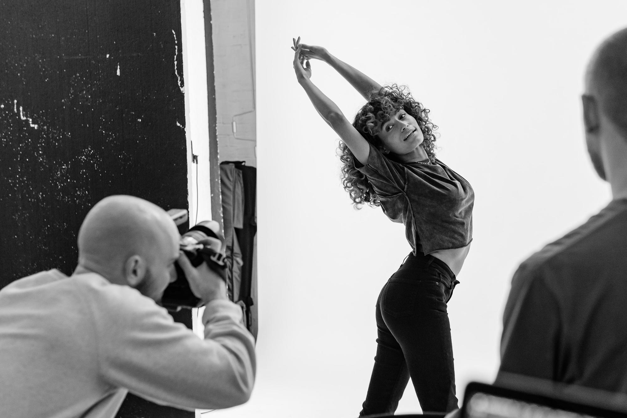
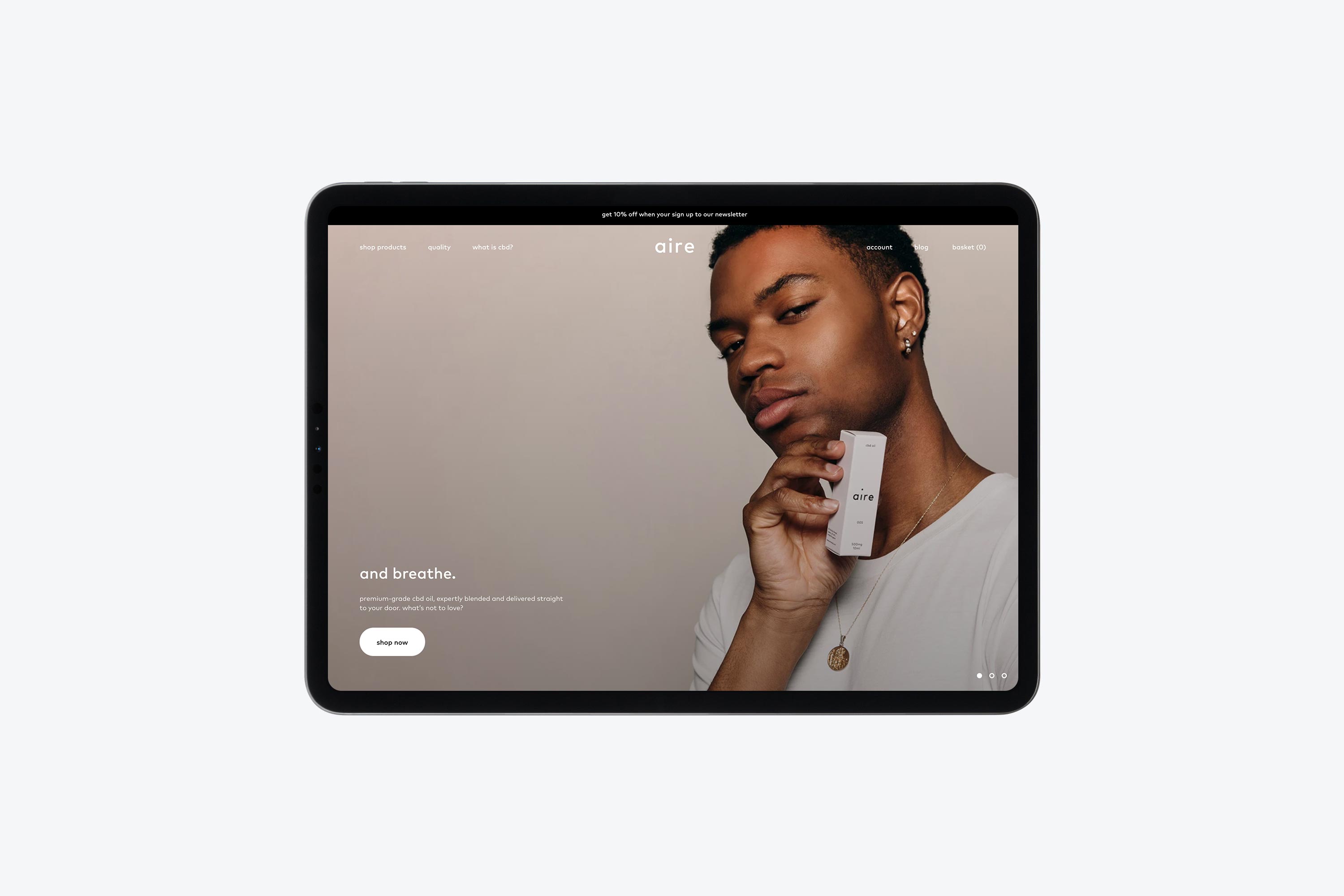
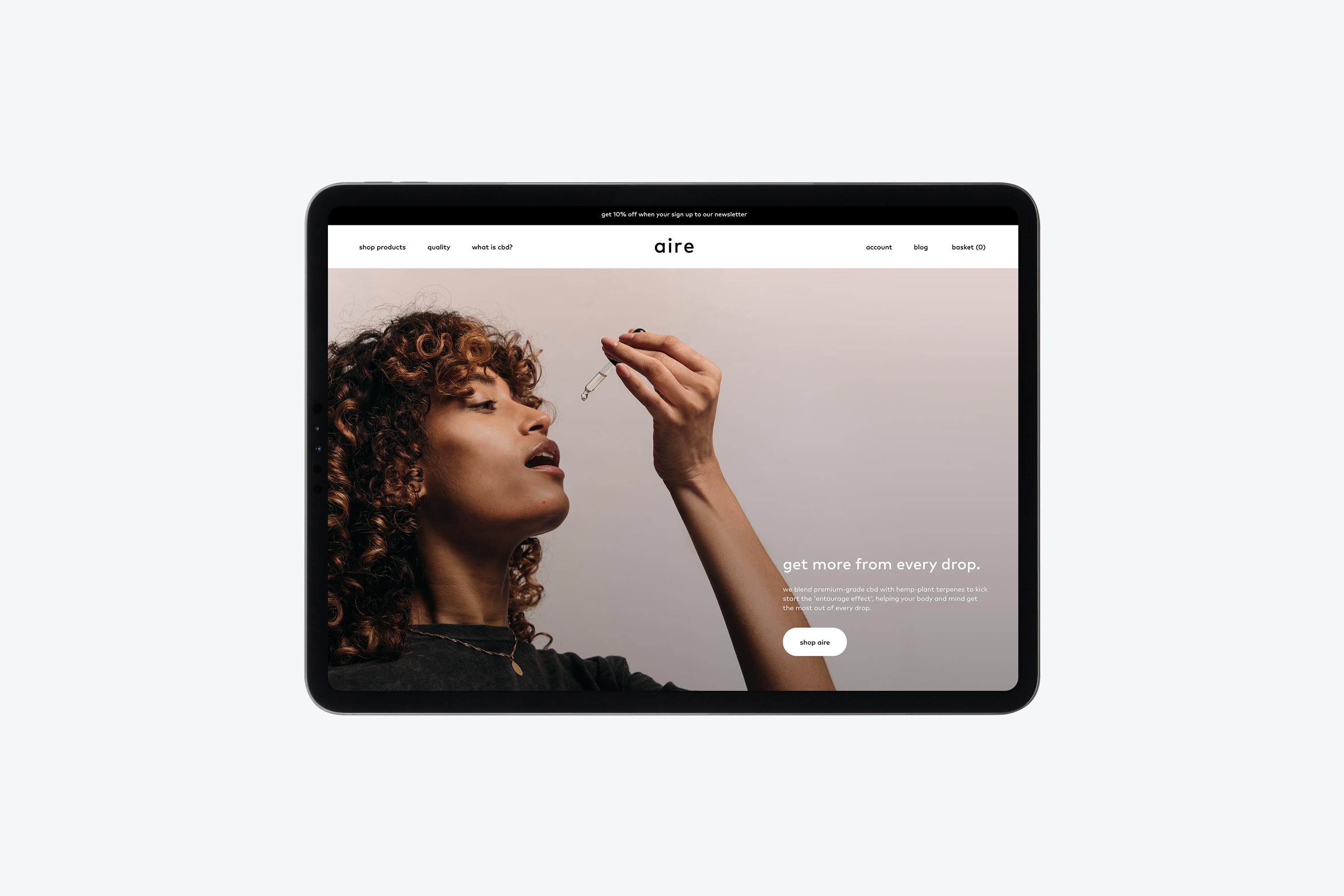
The premium aesthetic of the brand is captured by an art-directed photo shoot, in which models utilise natural body movements, with post-production being kept to a minimum to ensure an organic feel. Product photography was inspired by finding calm in harsh surroundings, using rough textures to showcase the simplicity of the brand alongside a brutalist environment.
The wordmark has been designed to convey the feeling of ease and simplicity whilst encapsulating a premium feel.
The bottles are constructed from frosted amber glass and designed with a white screen printed finish — doing away with the cliché label wrapped bottles that exist in the CBD industry. The packaging is made of 100% recyclable stock and each product has its own unique pastel colour that has been pattern embossed then foiled to give a premium finish.
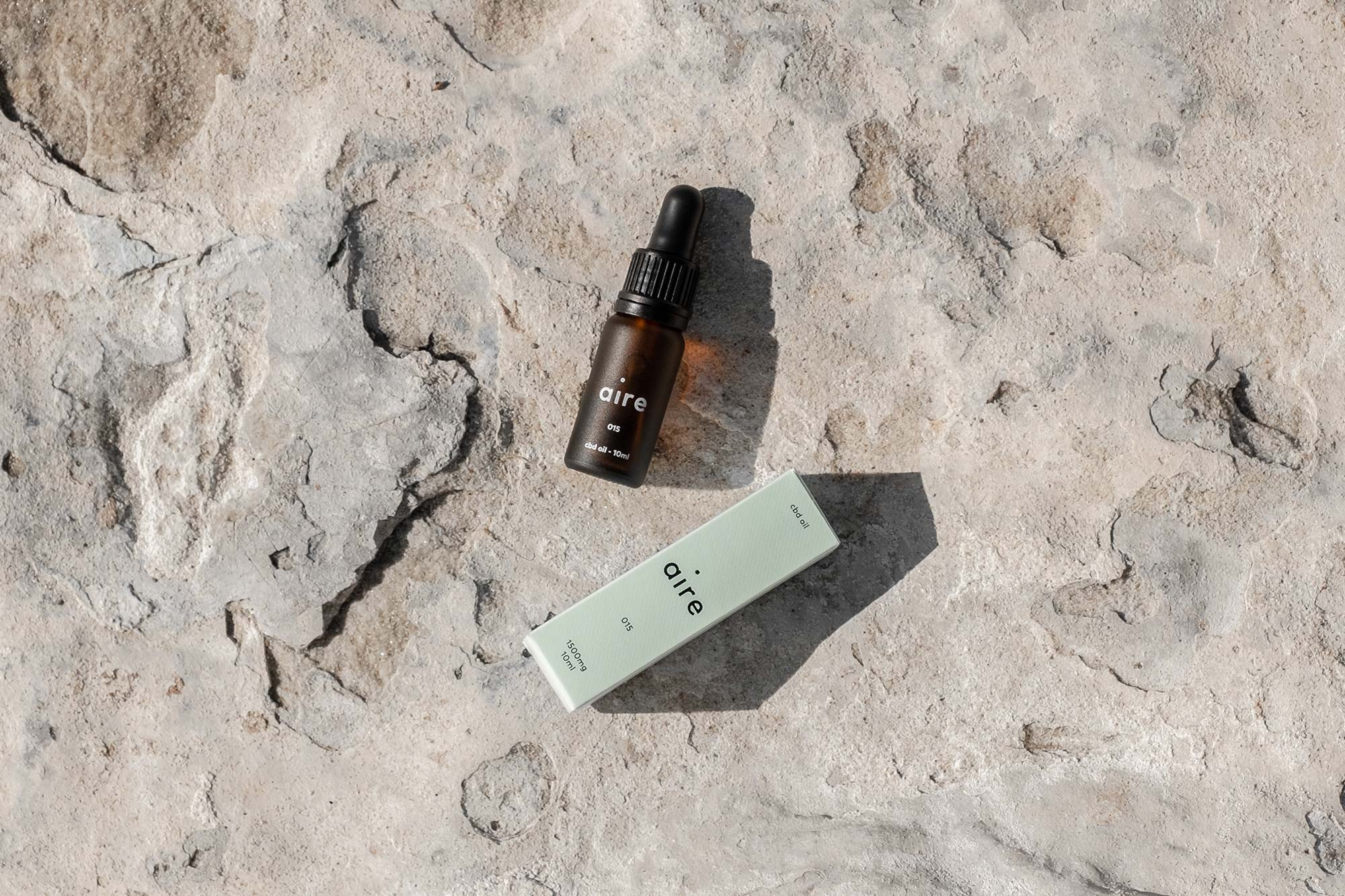
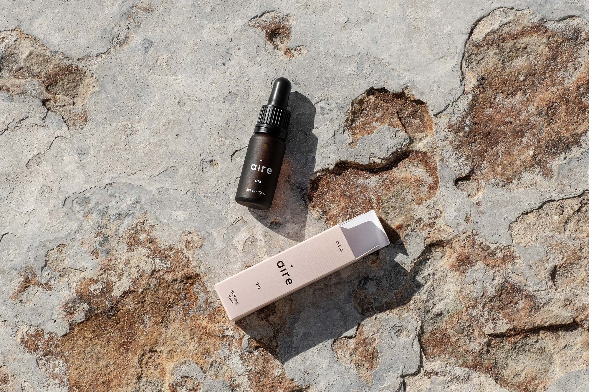
Product photography was inspired by finding calm in harsh surroundings, using rough textures to showcase the simplicity of the brand alongside a brutalist environment.
We selected 3 pastel colours that would serve as the primary colourway for the product range. Each chosen specifically to convey the way that product works. We then introduced a series of neutral colours which act as a complement to the primary colours.
005
010
015
White
Sand
Warm Grey
Black
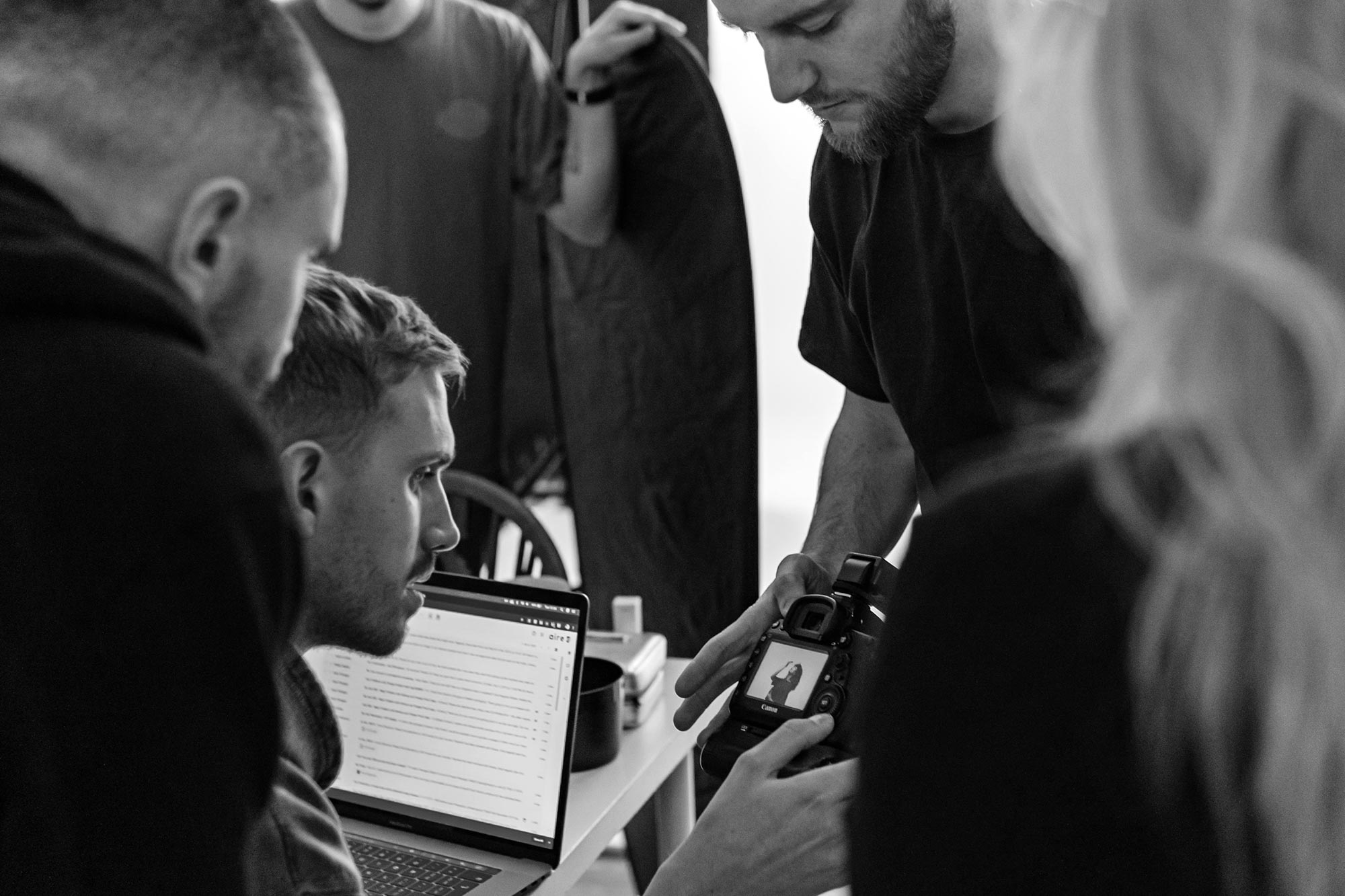
To capture the premium aesthetic of the brand, we art directed a photoshoot with models that could really hero the product. We captured the natural body movements of the models and kept post-production to a minimum to ensure a natural feel.
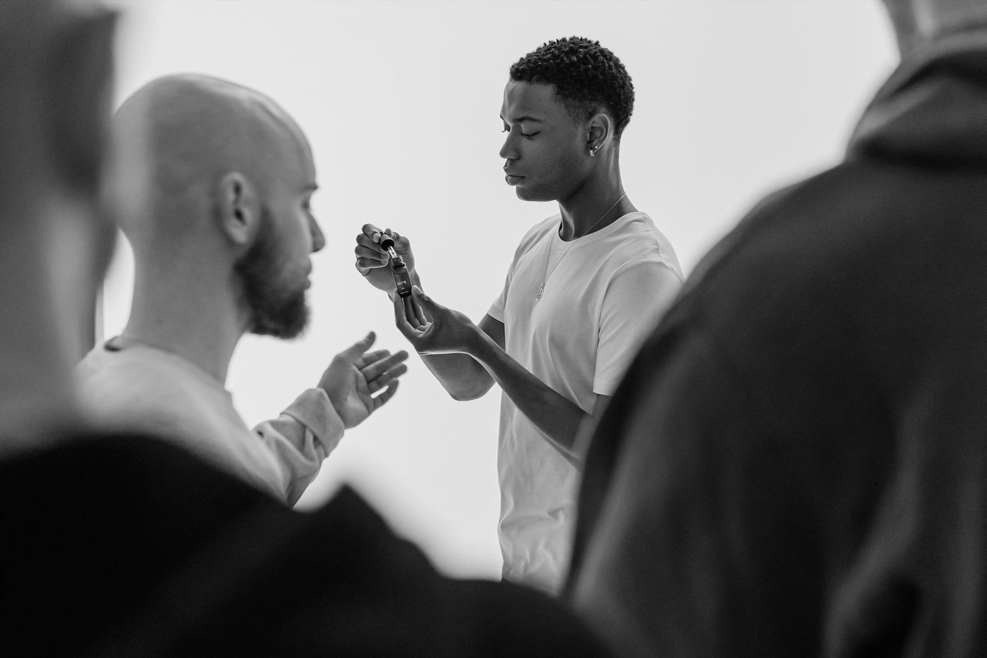
Behind the scenes
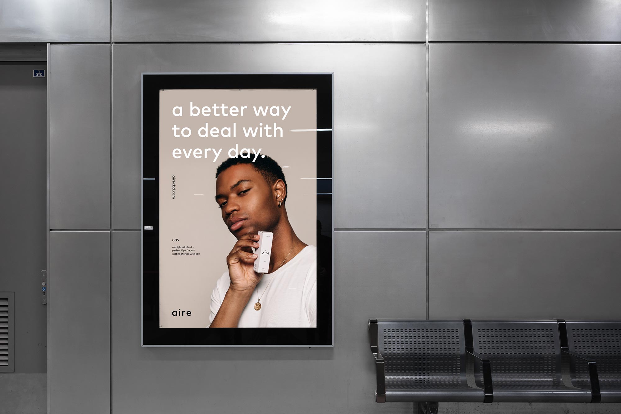
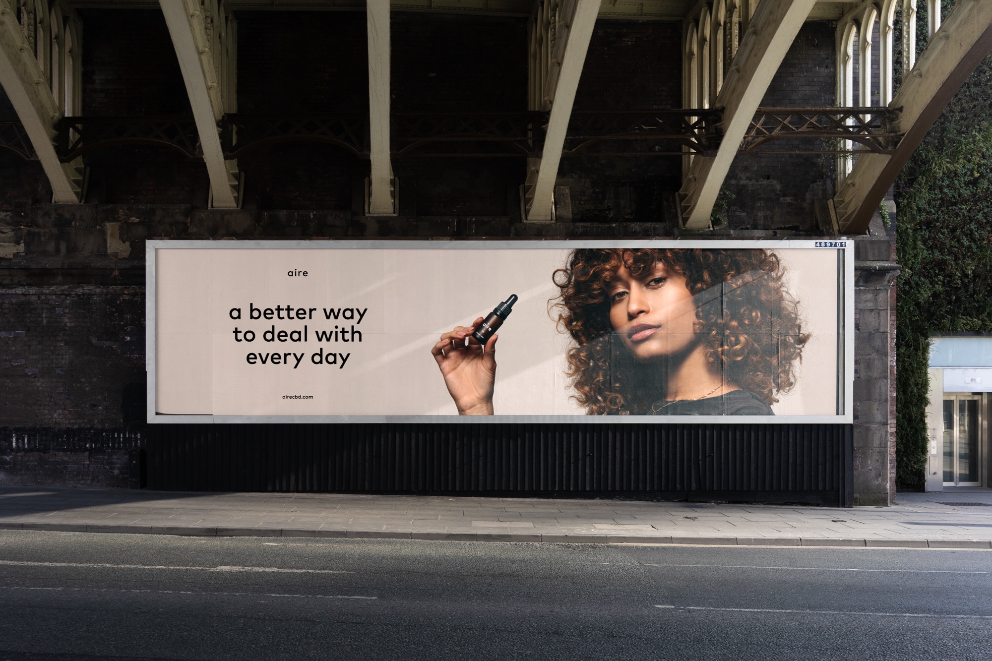
Aire believes in the power of CBD to help people manage the day to day a little better — so we developed a strap-line which embodied that message. A better way to deal with every day.
Guidelines were developed to bring all of the brand assets together and ensure brand consistency across all marketing collateral.
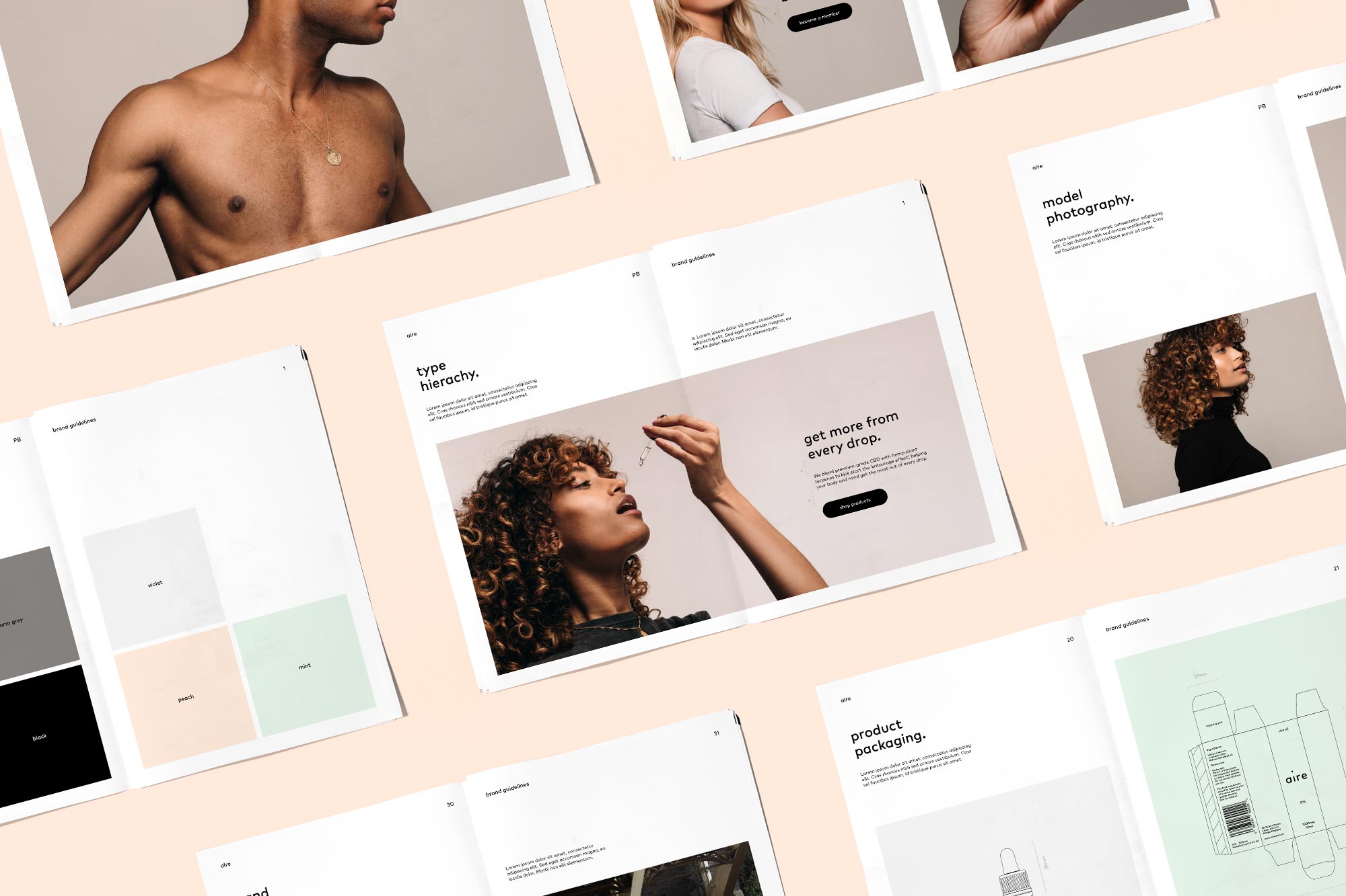
We developed a range of icons for use on the website and across marketing materials. The icons were designed with simplicity in mind and a creating harmony with the illustrations and the rest of the brand.
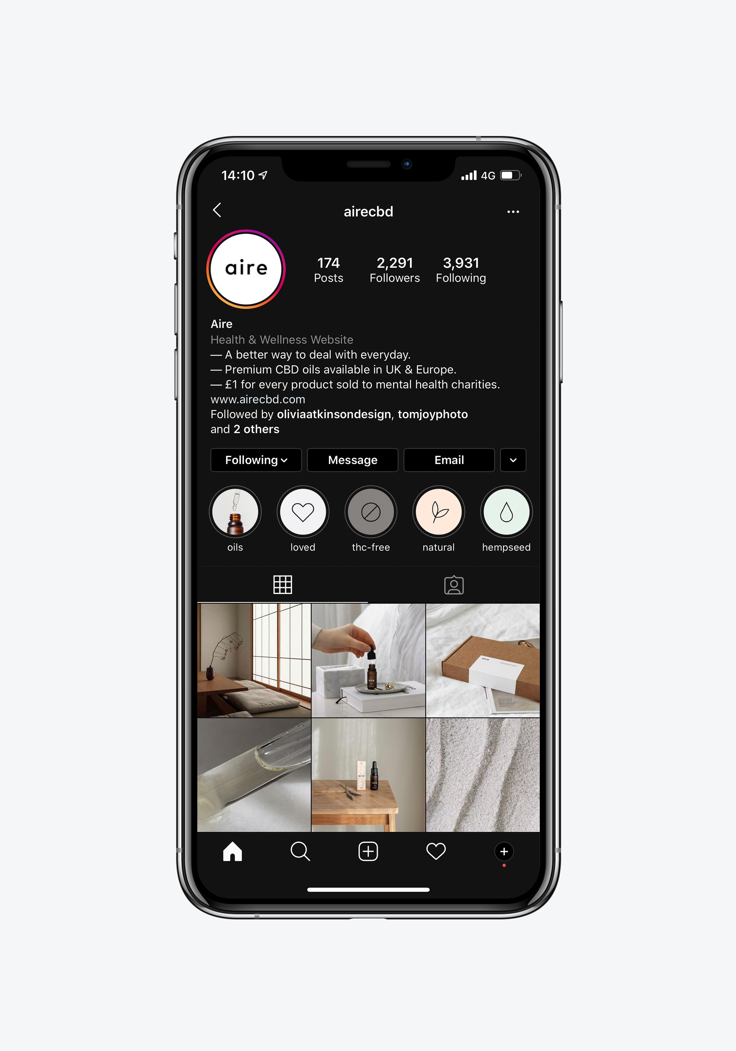
We worked with a lifestyle photographer to capture the product in real and authentic scenarios. This imagery combined with our carefully crafted copywriting creates a warm and relatable tone on social media.
Another application of the new brand was designing the Aire website; an e-commerce platform designed to inspire. We combined model and product photography with the other brand assets to bring life to the product.
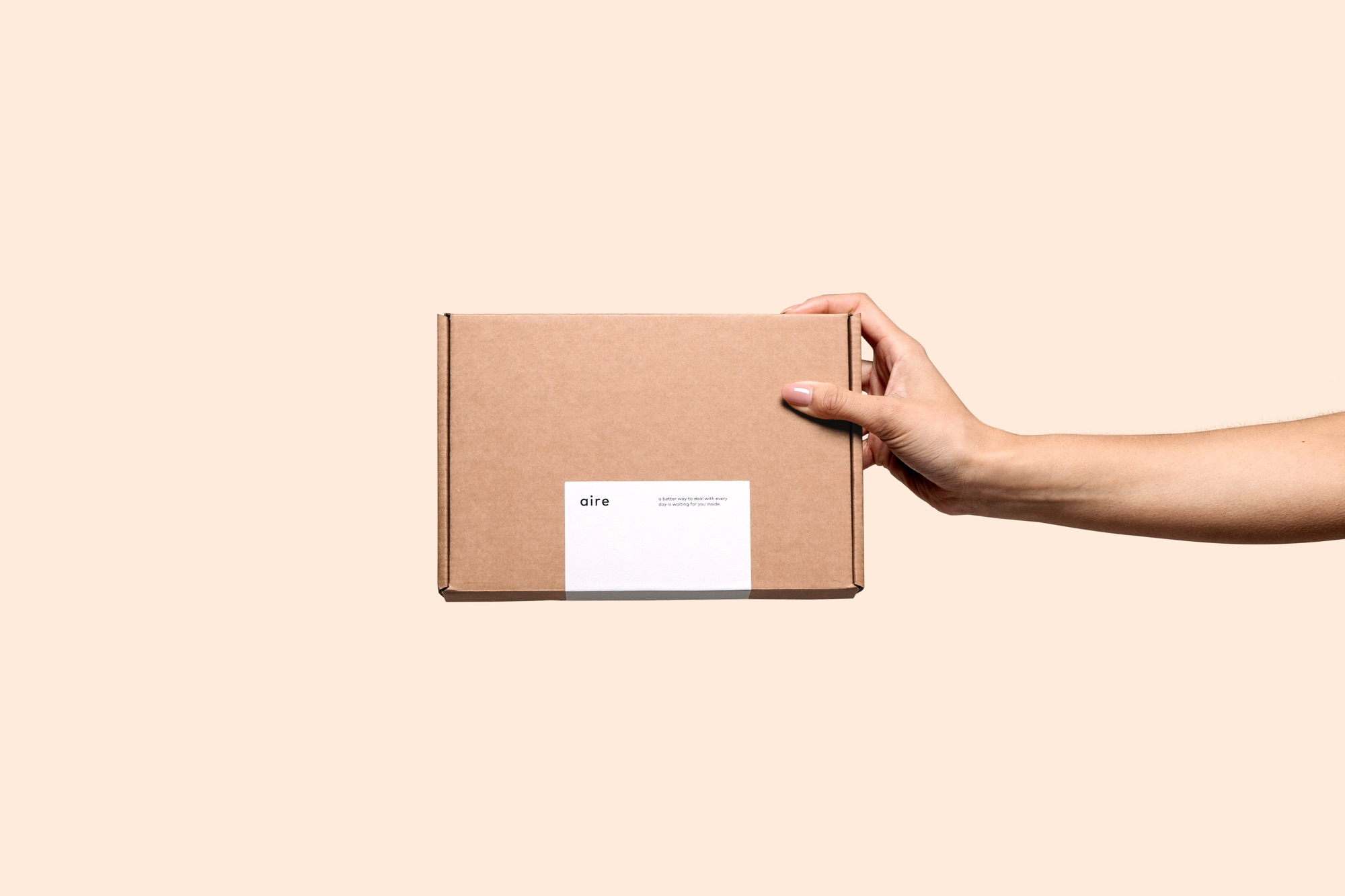
Aire wanted to be the first CBD brand in the UK to offer a subscription service — we worked with them to create a premium delivery box which would enhance the experience of opening the product each month.