Propeller
Client: Propeller
Project: Brand Identity
Year: 2020
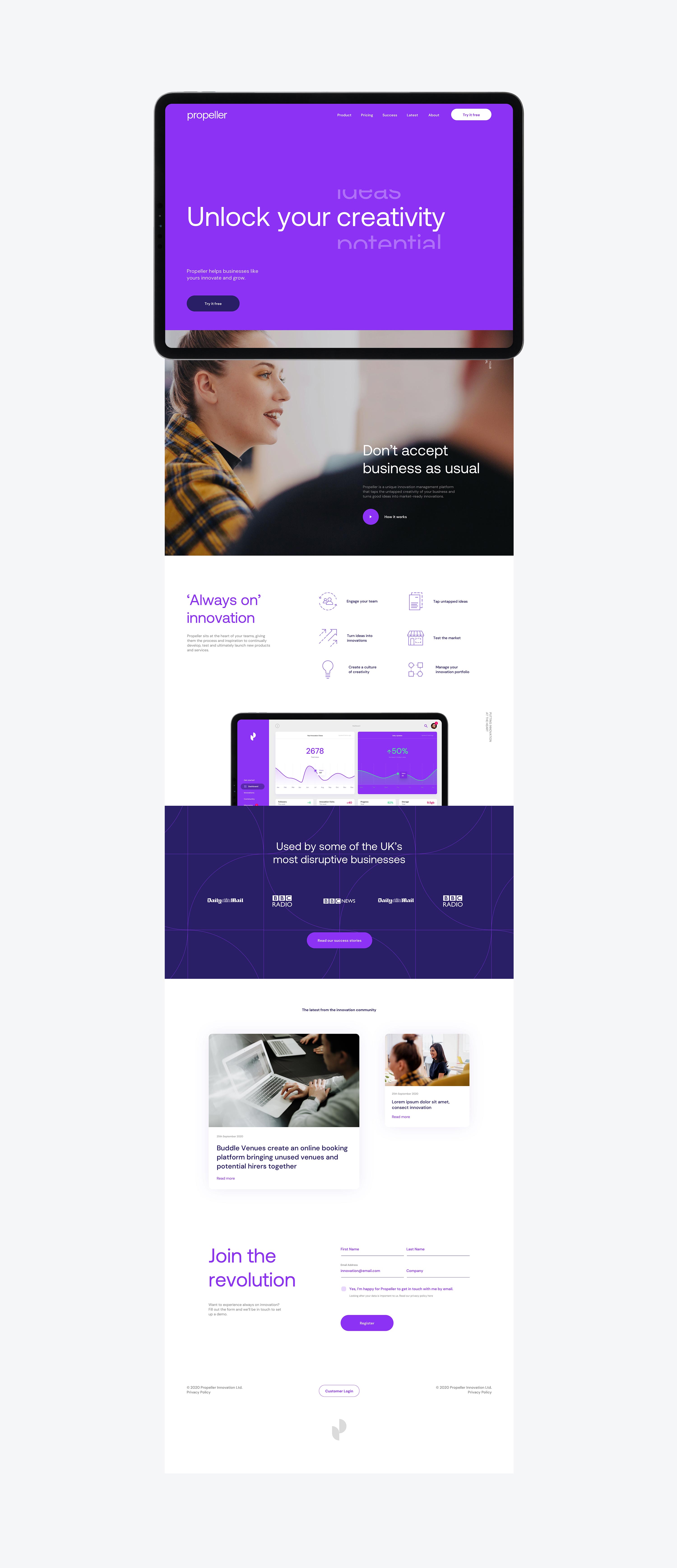
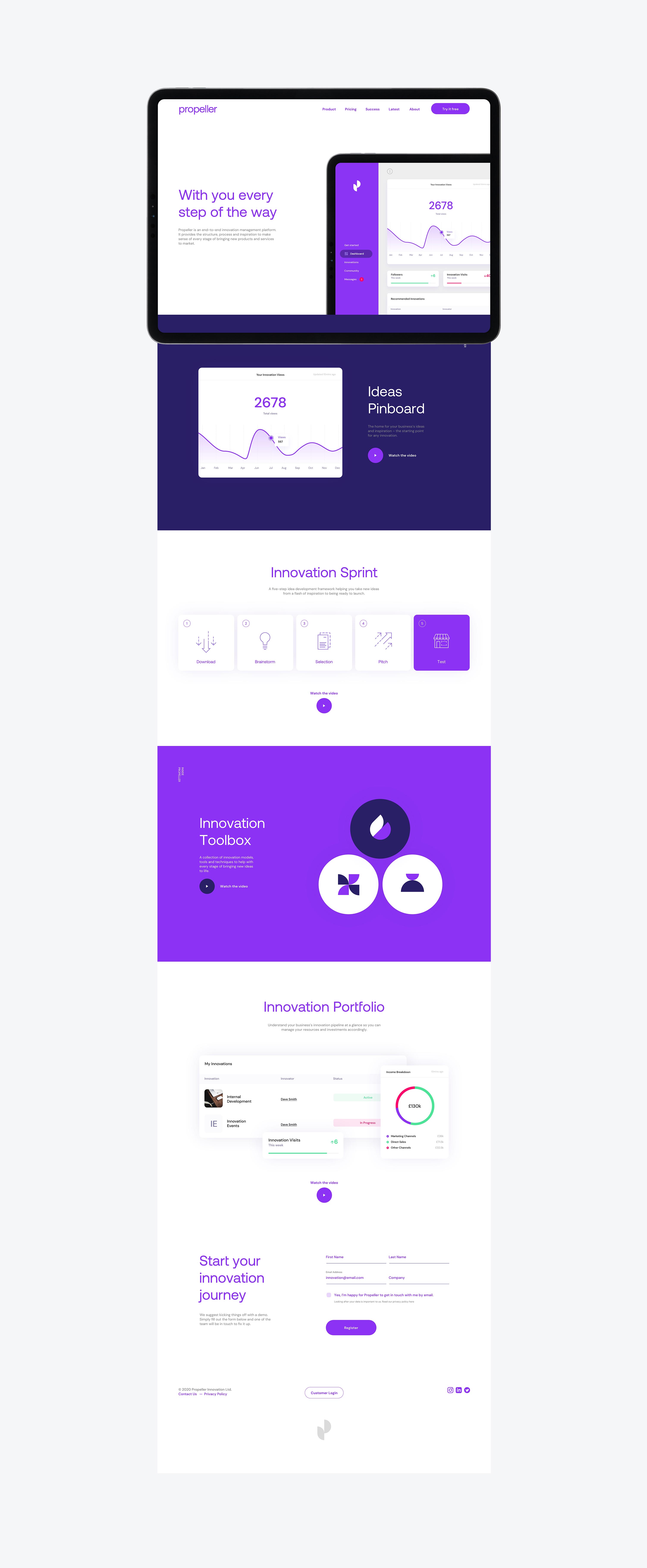
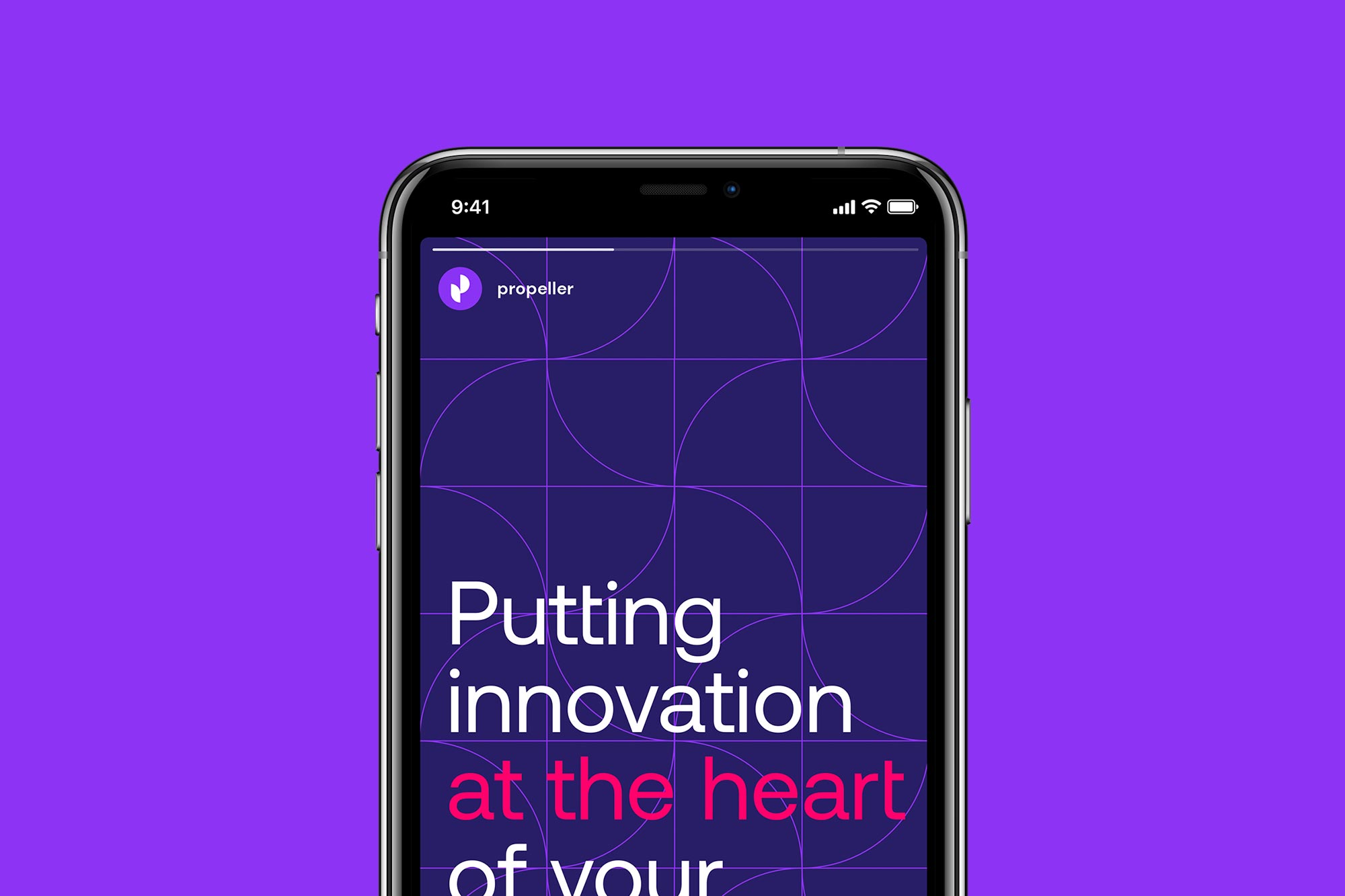
Propeller is a new way for your business to innovate. It’s a unique innovation management platform that taps the untapped creativity in your business and turns good ideas into market-ready innovations. We worked with Propeller to design their brand identity and design language.

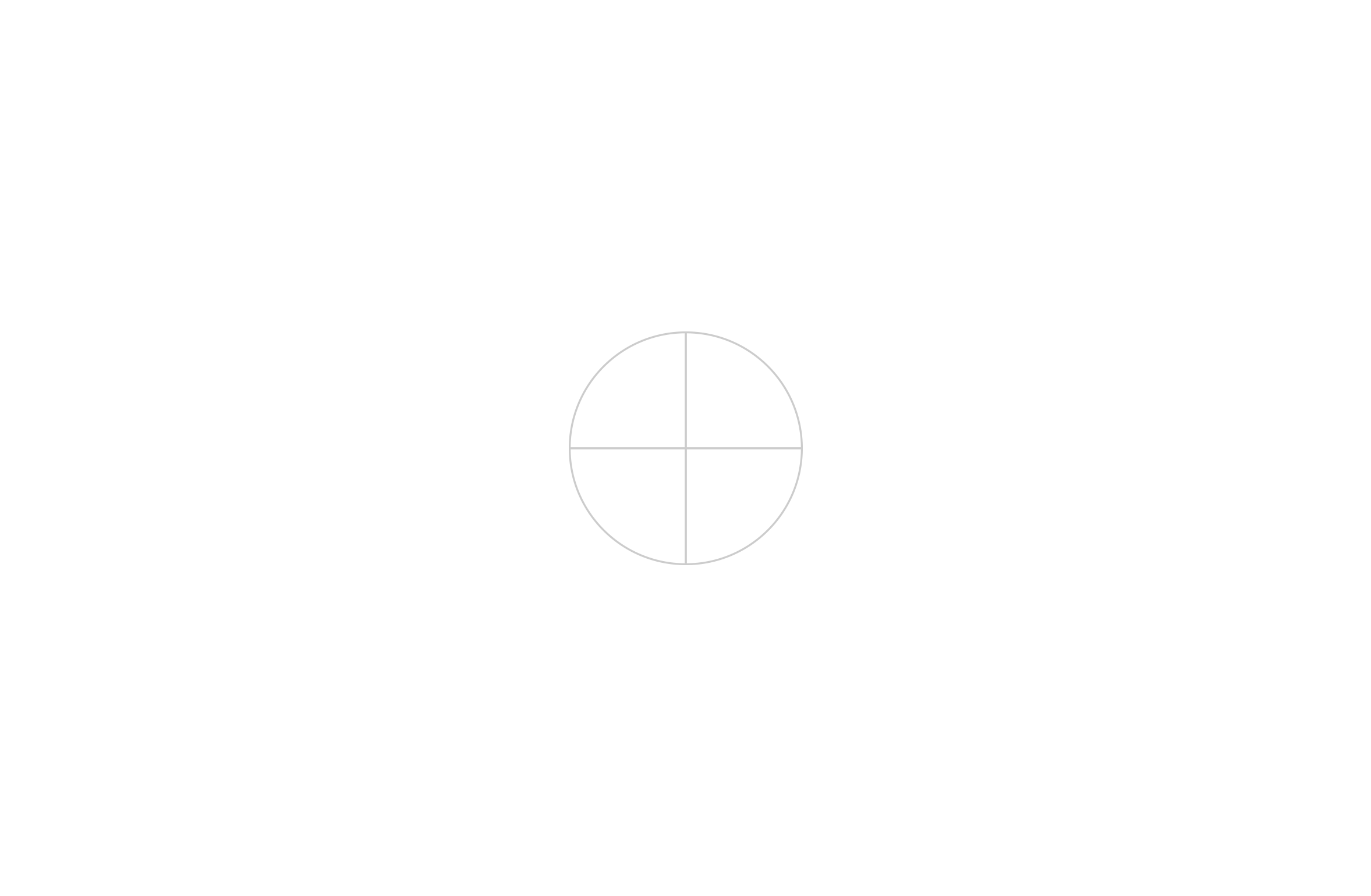
The name Propeller was inspired by the companies overall objective — to propel great business ideas. The identity was designed with this very objective in mind. The logomark is formed from a propeller shape to create a unique letter P.
The logo is made up of quarter circles. These same shapes will go on to be used in all graphics.
We selected 8 distinctive colours that would serve as the colourway for the brand. With the prominent colour being violet.
White
Lilac
Violet
Ruby
Light Grey
Black
Dark Blue
Amethyst
We used the quarter circles to create a variety of icons that would visualise the 'tools' of the software.


Guidelines were developed to bring all of the brand assets together and ensure brand consistency across all marketing collateral.
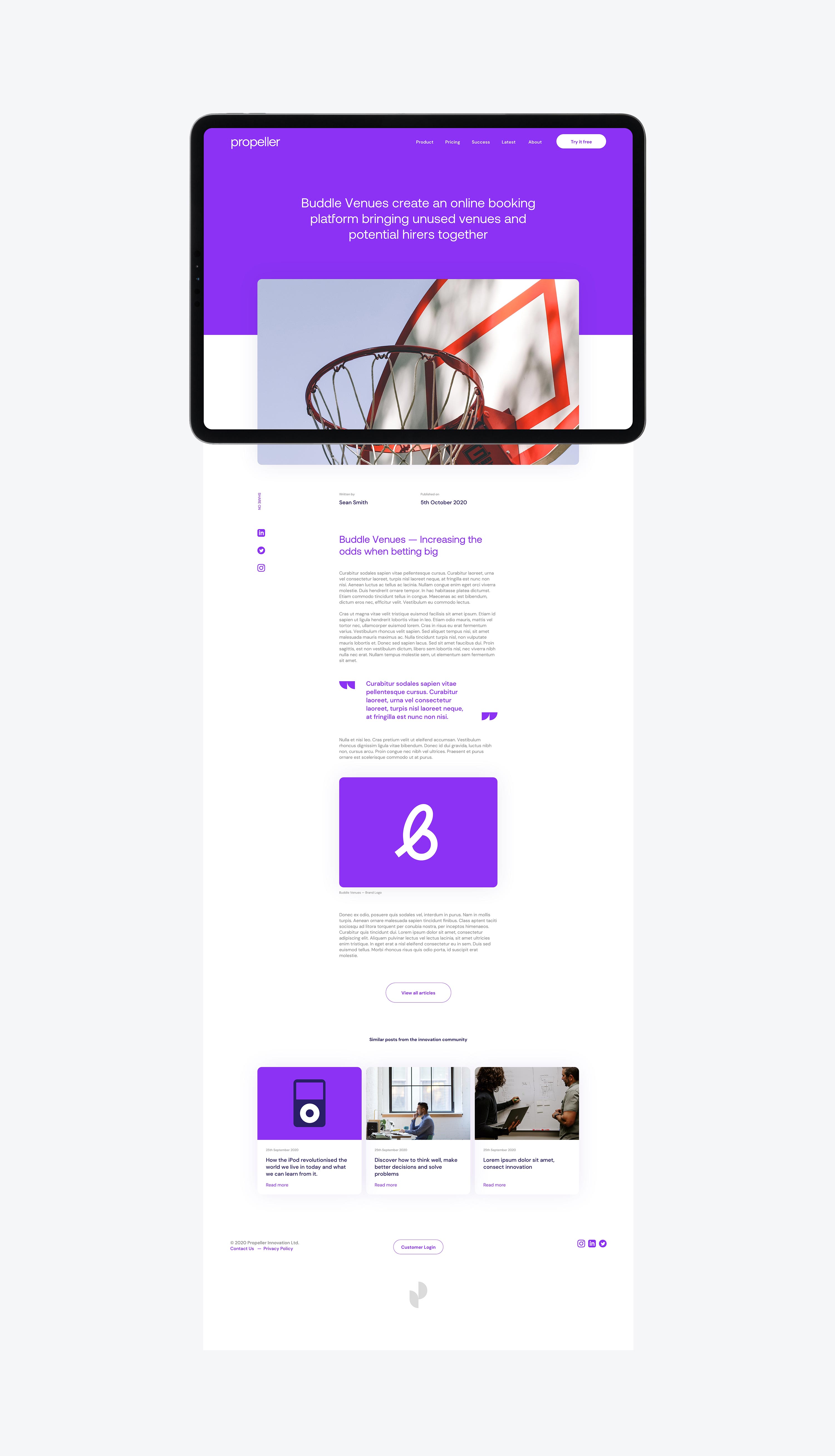
Social content that propels and compels.
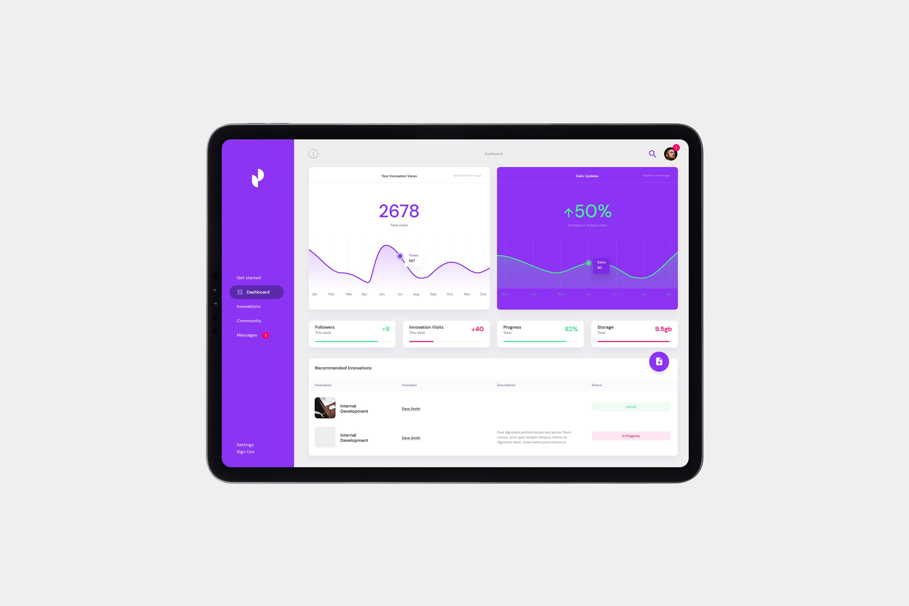
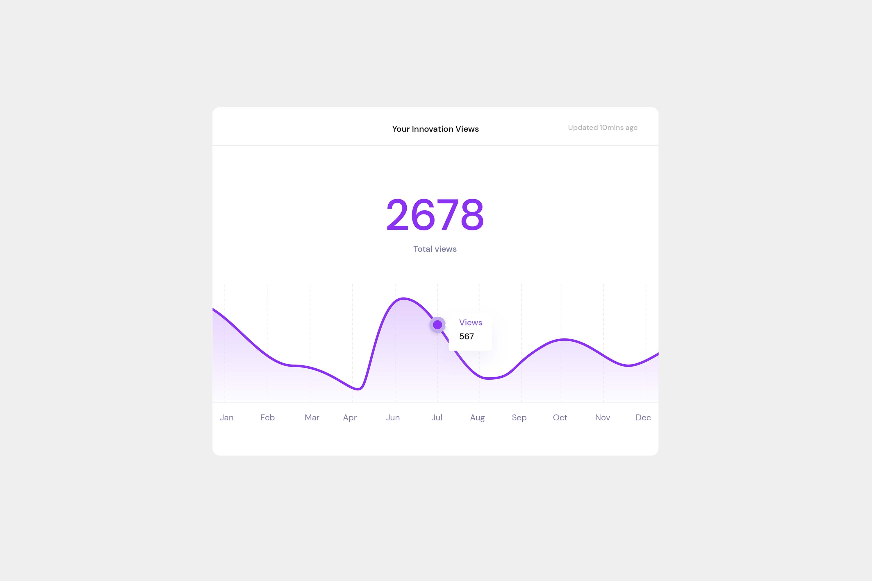
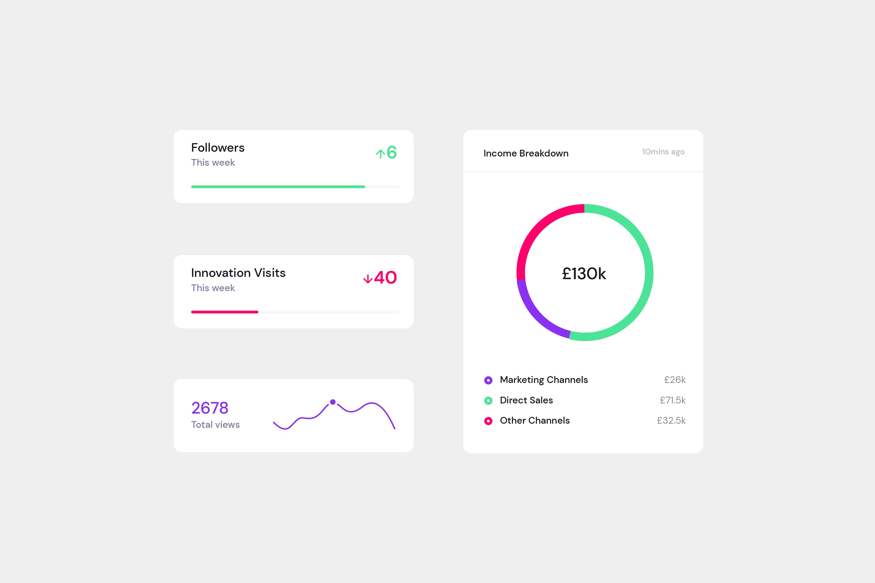
An interface that really informs.
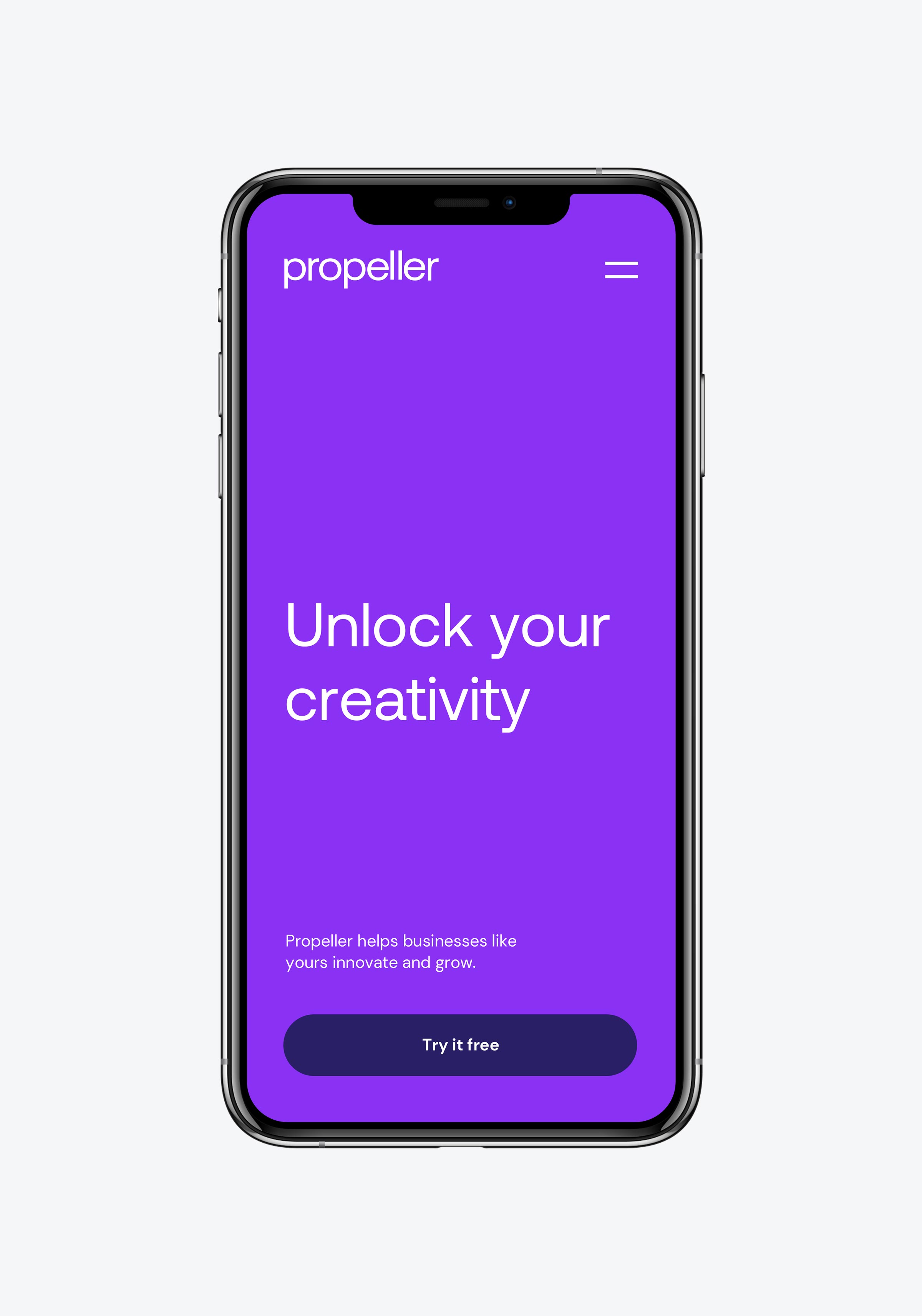
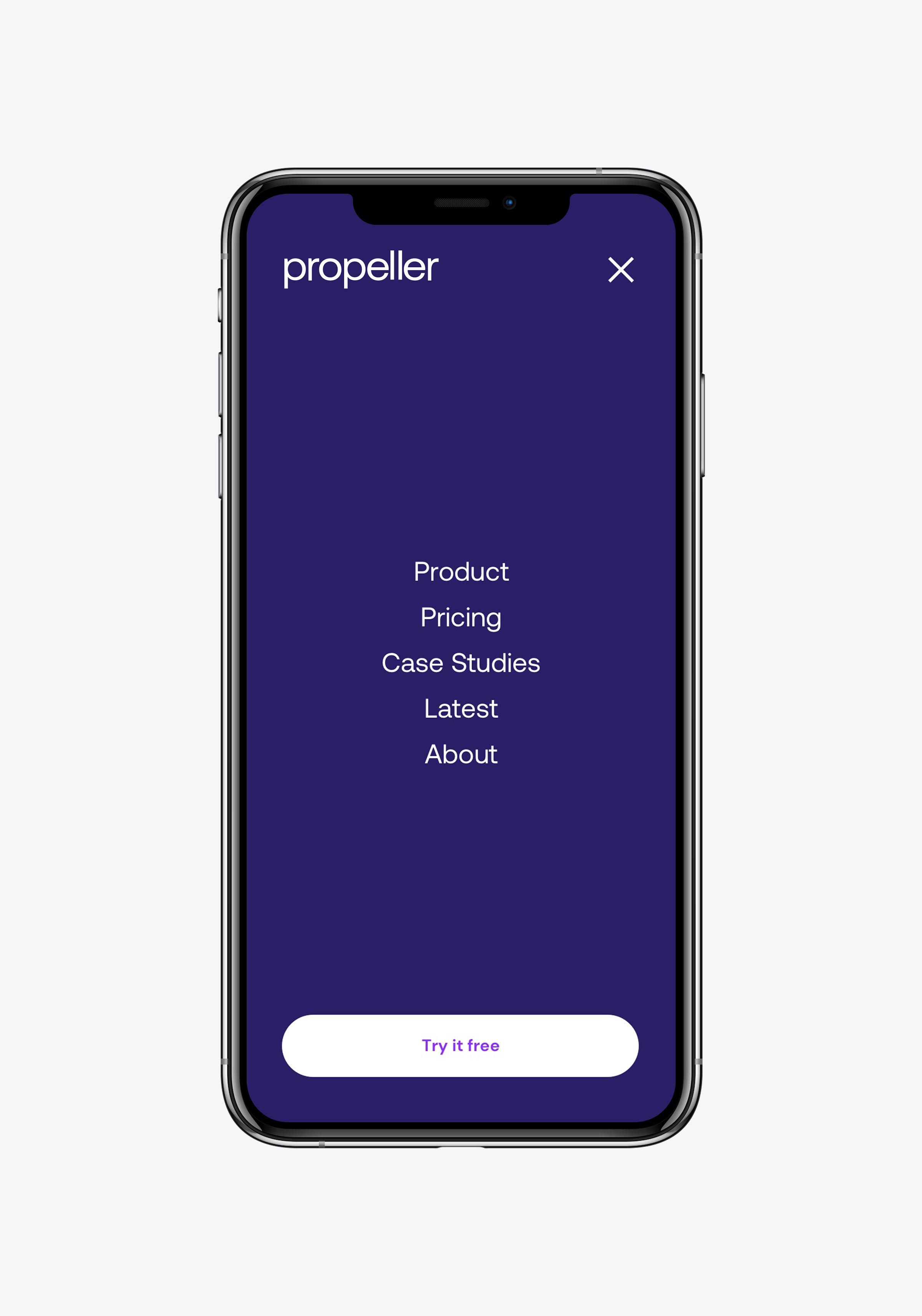
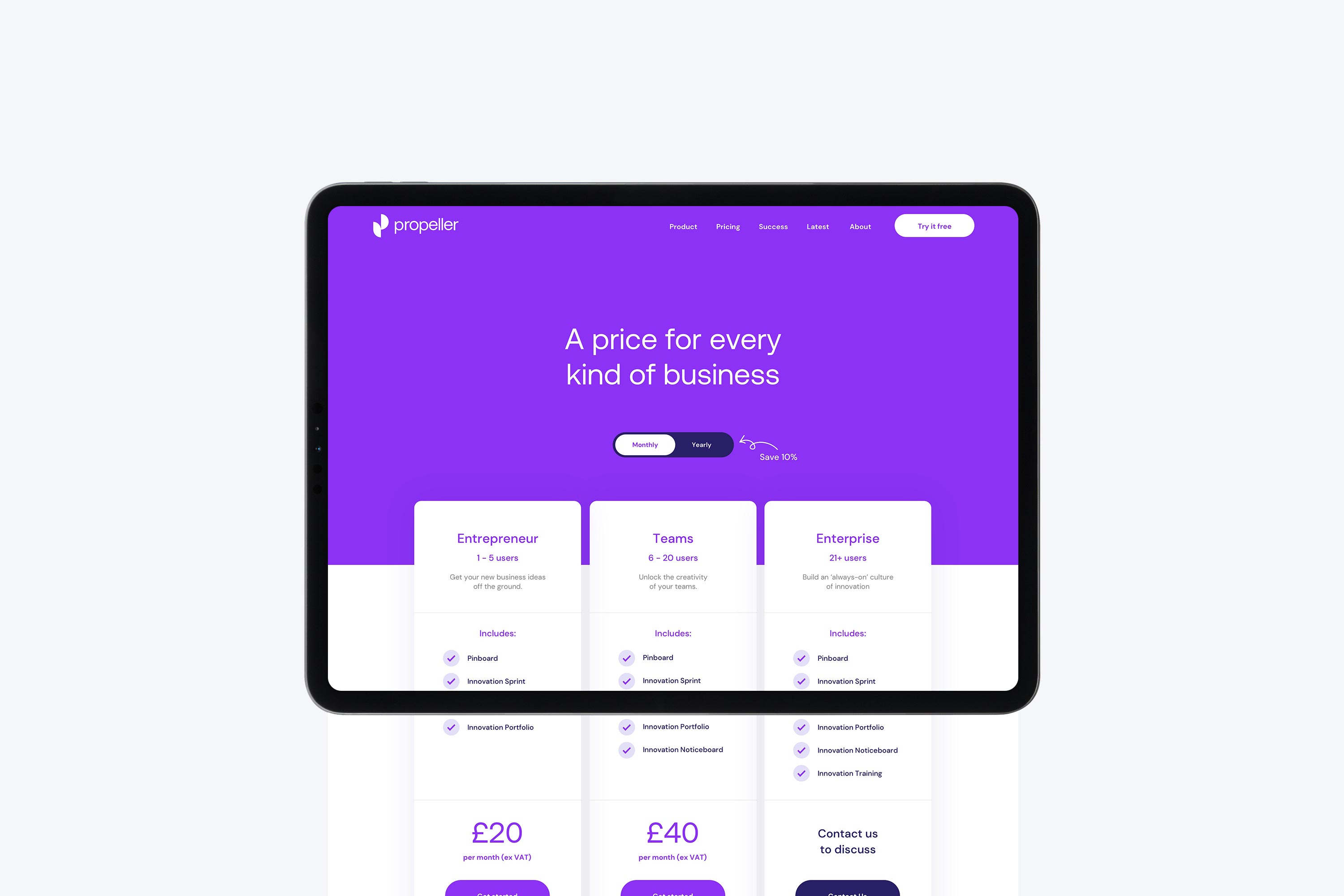
A website that really convinces.